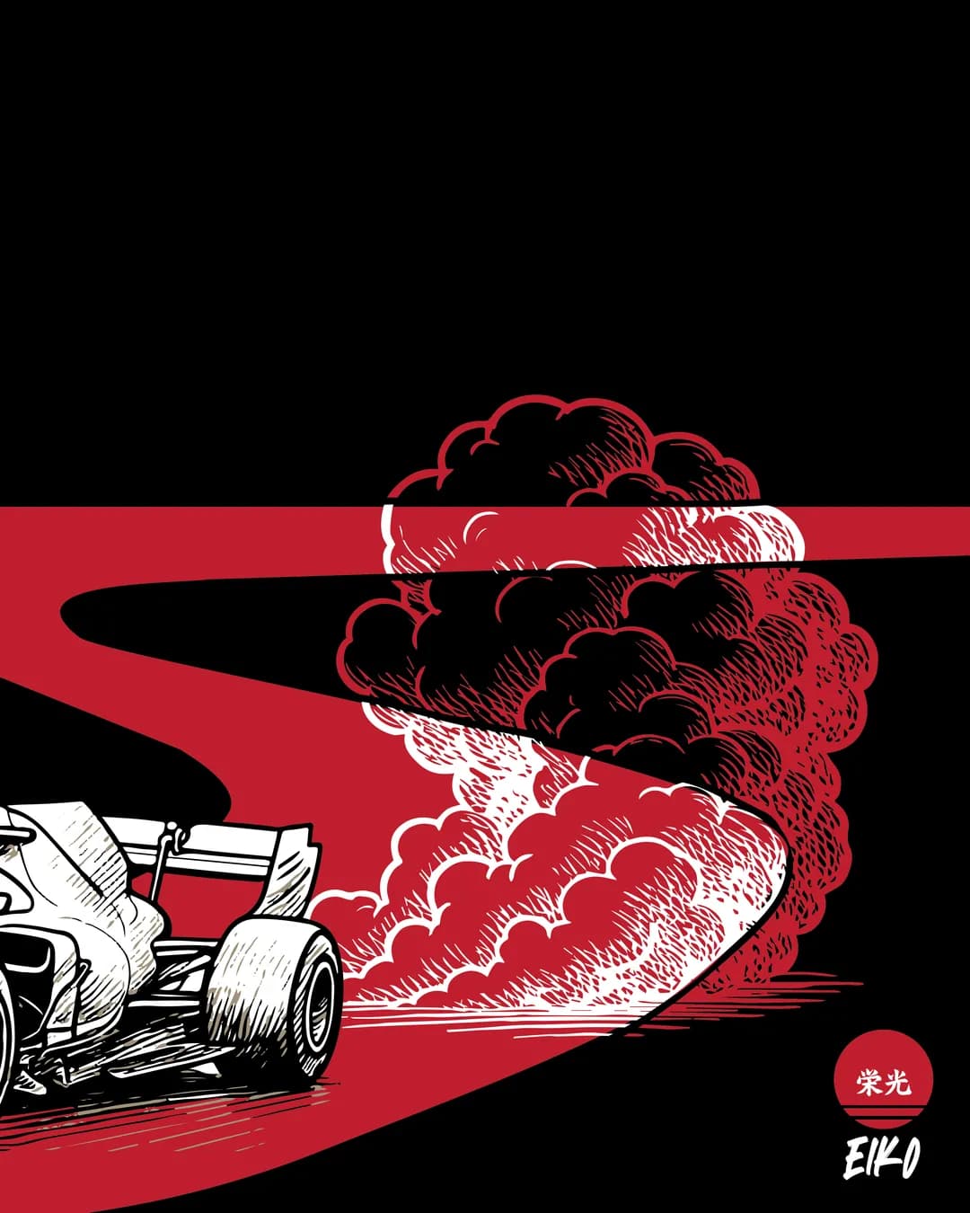
EIKO
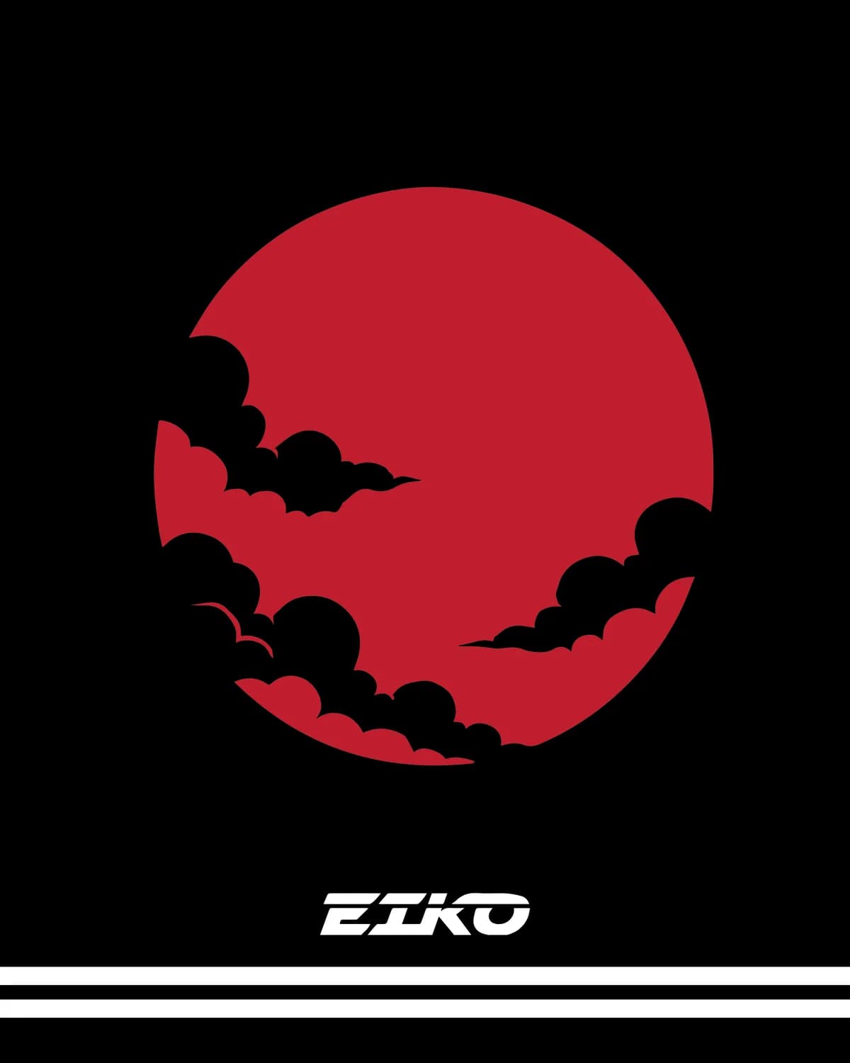
栄光 (eikō) means glory in Japanese. The brand name, the mark and the tagline all run off it.
Challenge
Brick-built model kits are a commodity category. The boxes look alike, the branding is interchangeable, and once the model is built the packaging goes in the bin. EIKO needed to sell a considered object into a market that treats its products as toys.
- Brick-built model kits sell as a commodity
- Lookalike boxes, interchangeable branding
- The packaging ends up in the bin
Approach
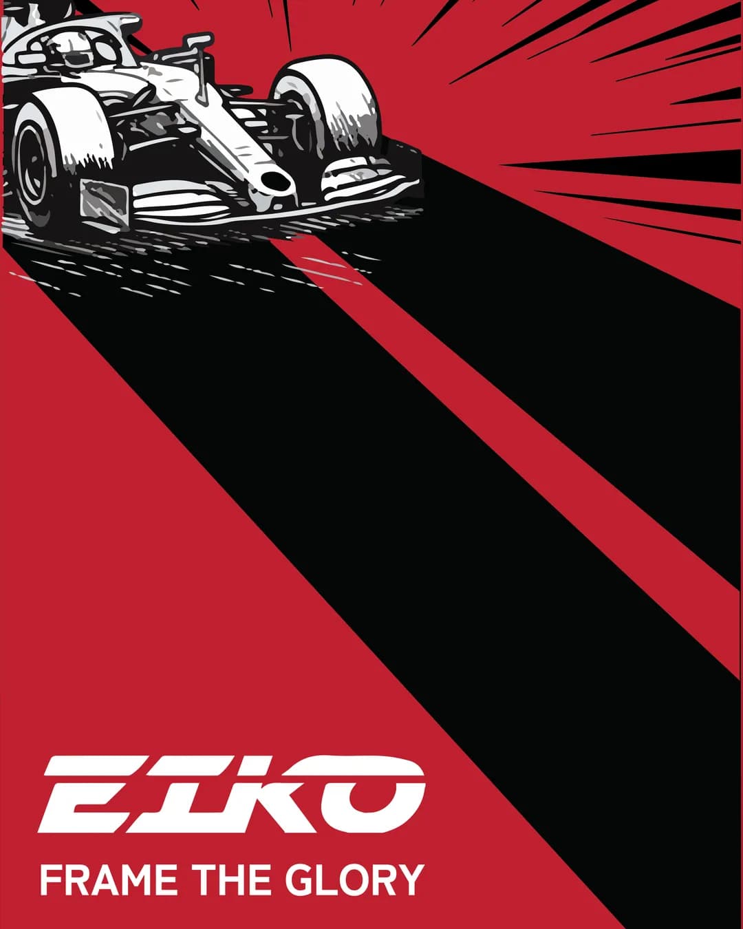
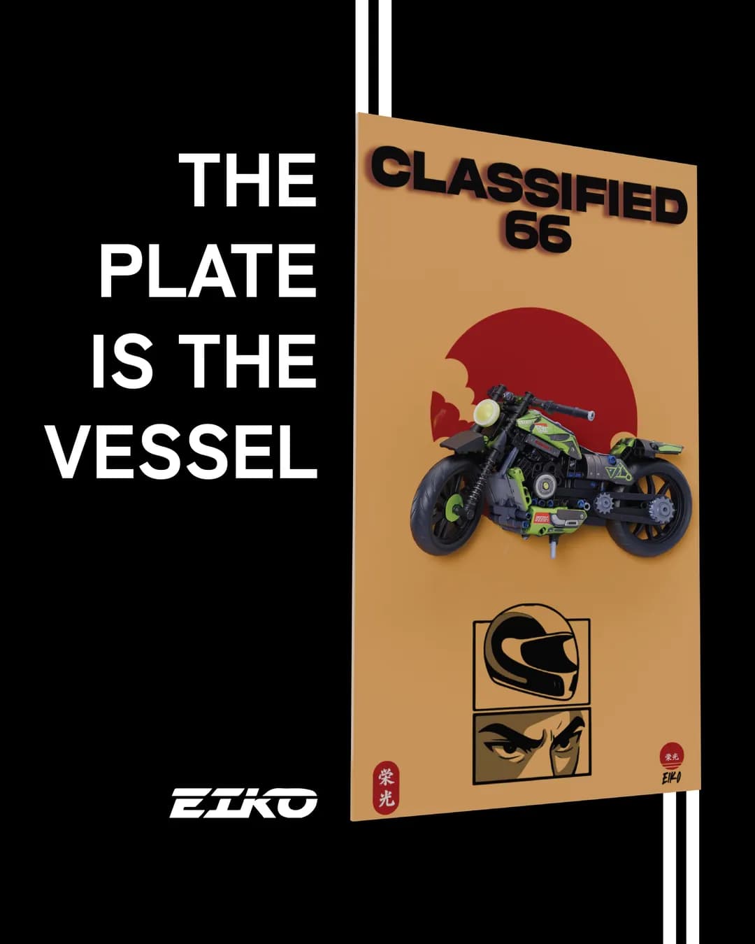
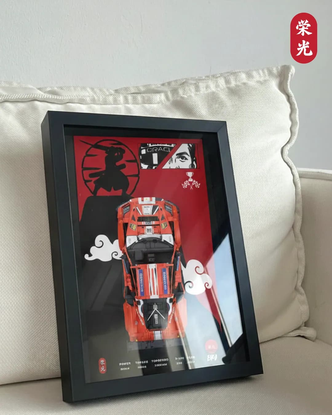
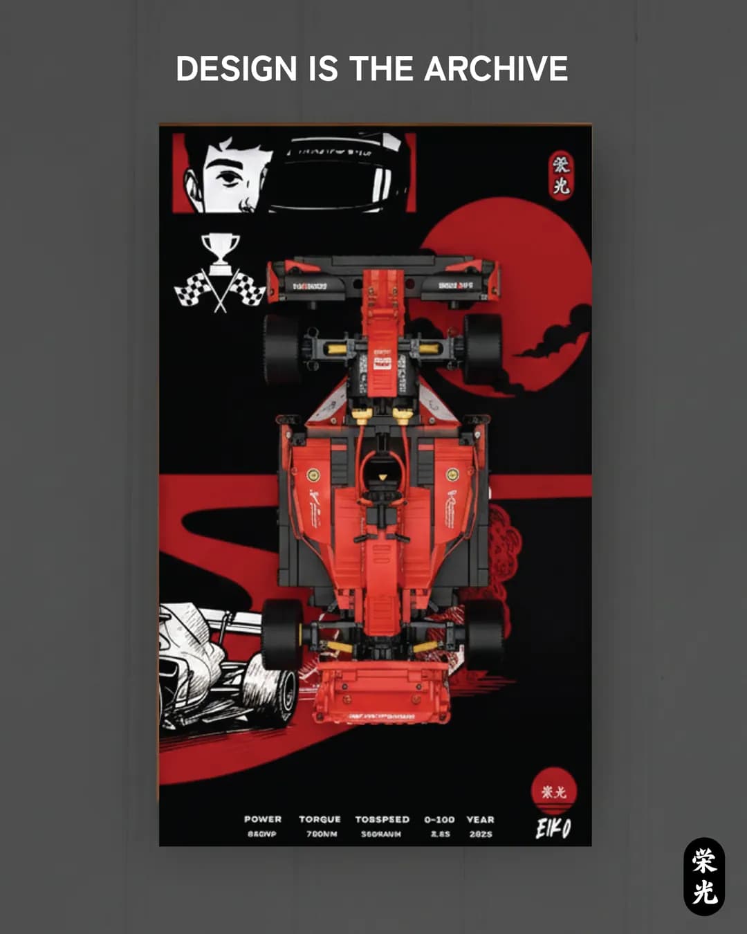
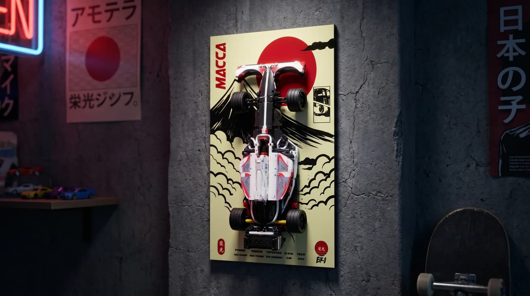
The move was to make the packaging the display rather than the wrapper. Each model is mounted on a poster-grade backdrop with its own artwork and a performance spec strip, so the finished product is something you hang rather than something you unbox and discard. That decision set everything else: it demanded real art direction per product, a naming system with internal logic, and a store built to show the artwork at the size it deserves.
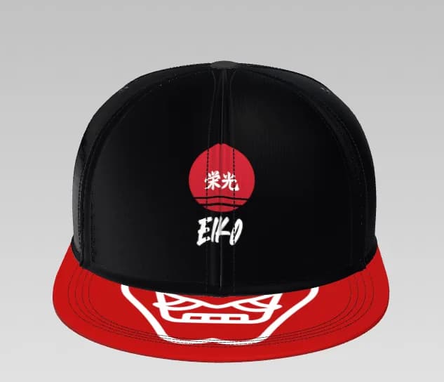
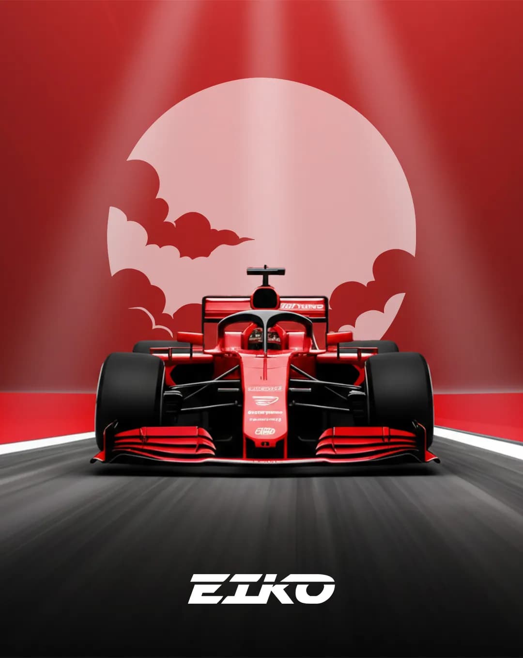
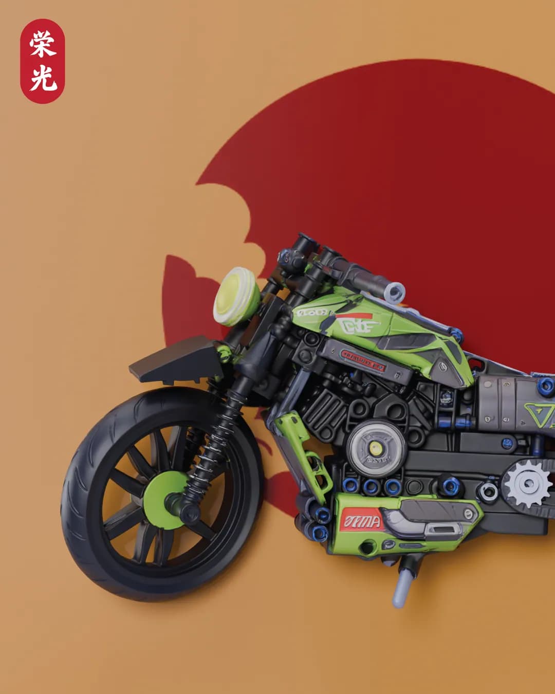
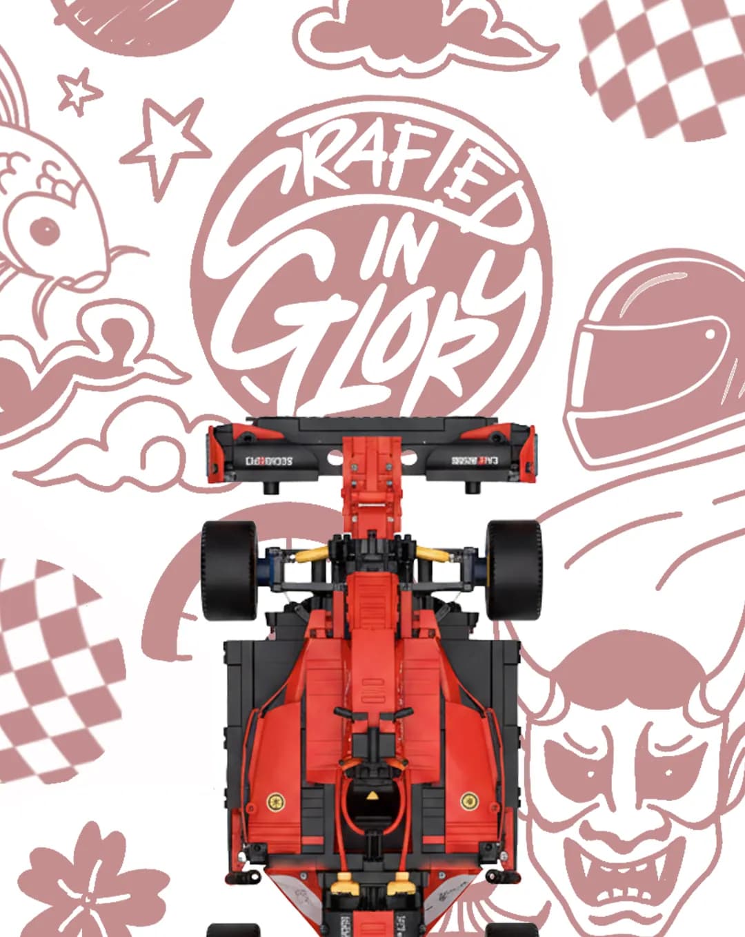
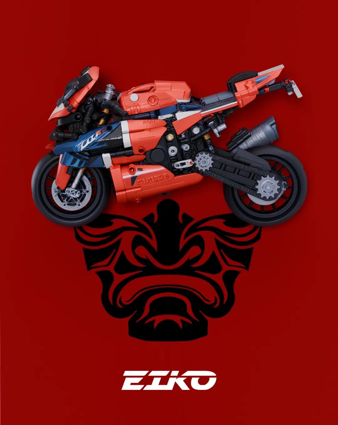
The brand runs on its own name. 栄光, glory, became a visual language of rising suns, oni masks, brush lettering and manga framing, carried through the mark, the tagline "Crafted in Glory", the packaging and the merchandise.
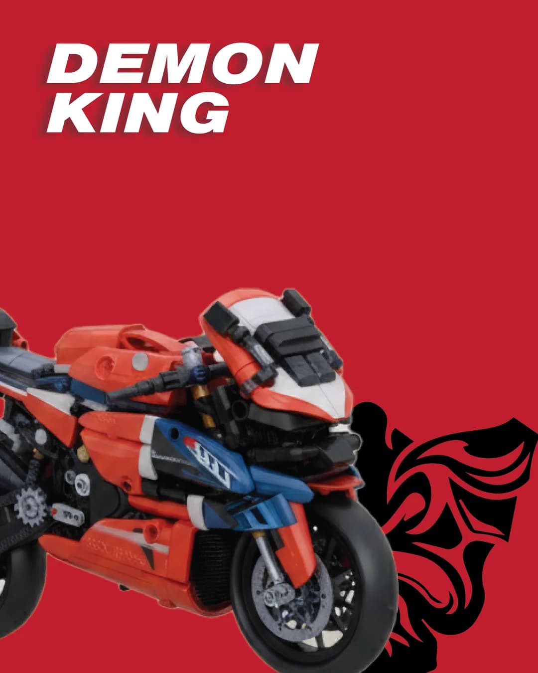
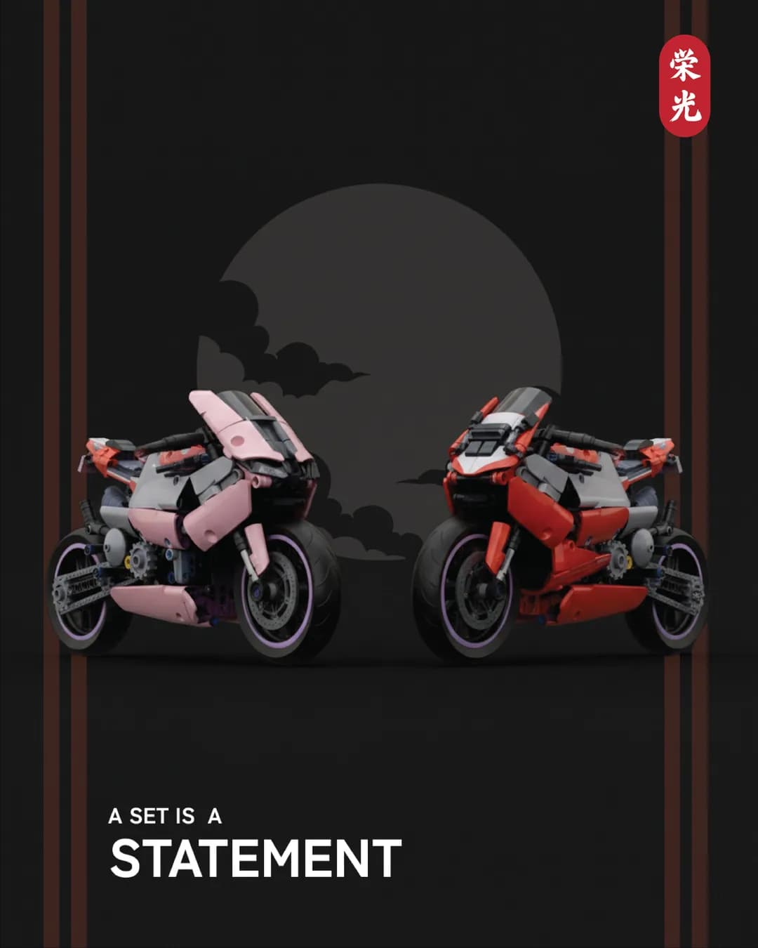
Products are named rather than numbered. Japanese colour and concept words sit against the real vehicle designation, so the white car becomes SHIRO and the range reads as a set rather than a catalogue. Flagship pieces get character names, WIDOWMAKER and DEMON KING among them.
- The packaging becomes the display, not the wrapper
- Every model framed with its own artwork and spec strip
- The name, glory, drives a Japanese visual language
- Products named, not numbered: SHIRO, WIDOWMAKER, DEMON KING
What shipped
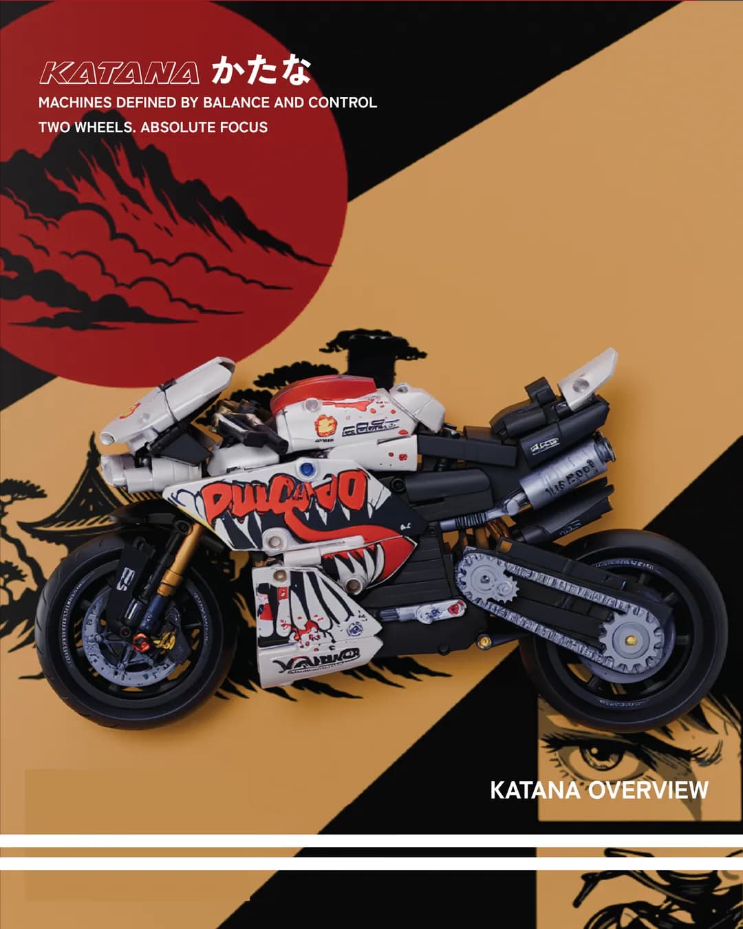
A full identity: mark, lettering, tagline and the Japanese visual system behind it. Packaging and display artwork across the range, each with bespoke illustration and a spec strip, organised into three lines: KURUMA for cars, KATANA for motorcycles, ENSHI for the frame itself.
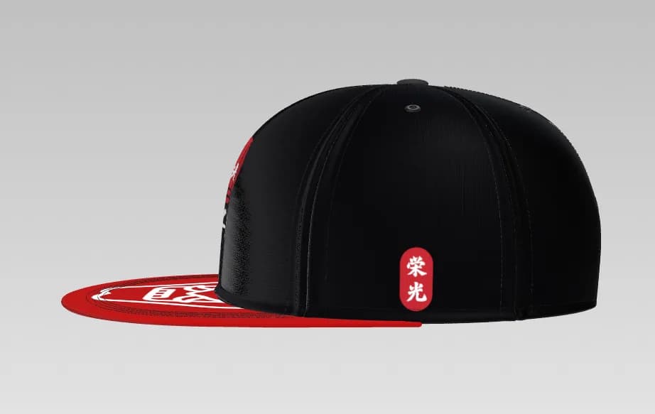
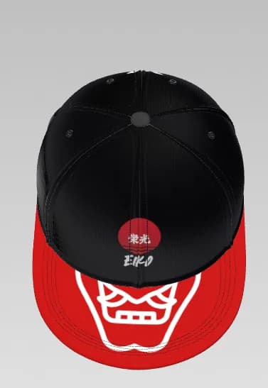
A Shopify storefront at eikousa.com, themed so the brand pattern carries through the shopping experience rather than stopping at the homepage. Merchandise extending the system into apparel, including the samurai snapback. Social and content production to launch it.
- Identity: mark, lettering, tagline and visual system
- Display artwork across KURUMA, KATANA and ENSHI
- A themed Shopify storefront
- Merchandise, including the samurai snapback
- Social and launch content
Align
The packaging was not a box designed after the fact. It was the product decision. Treating the display as the deliverable is what moved the range out of the toy aisle, and that call came before any artwork.
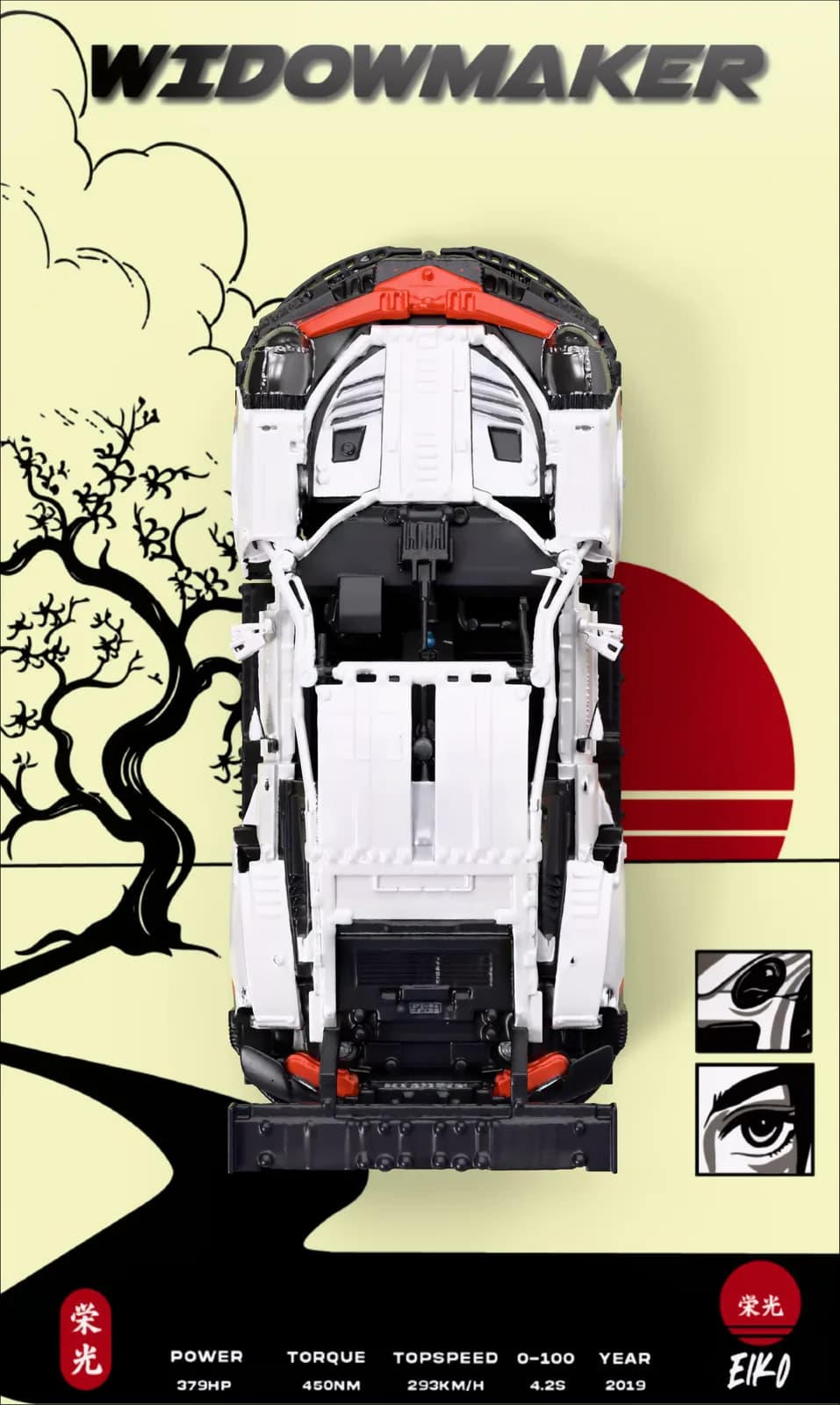 SHIRO 911WIDOWMAKER
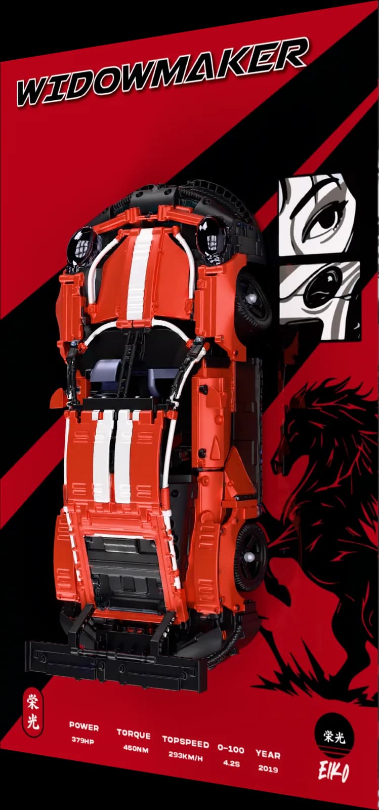 AKA 911WIDOWMAKER
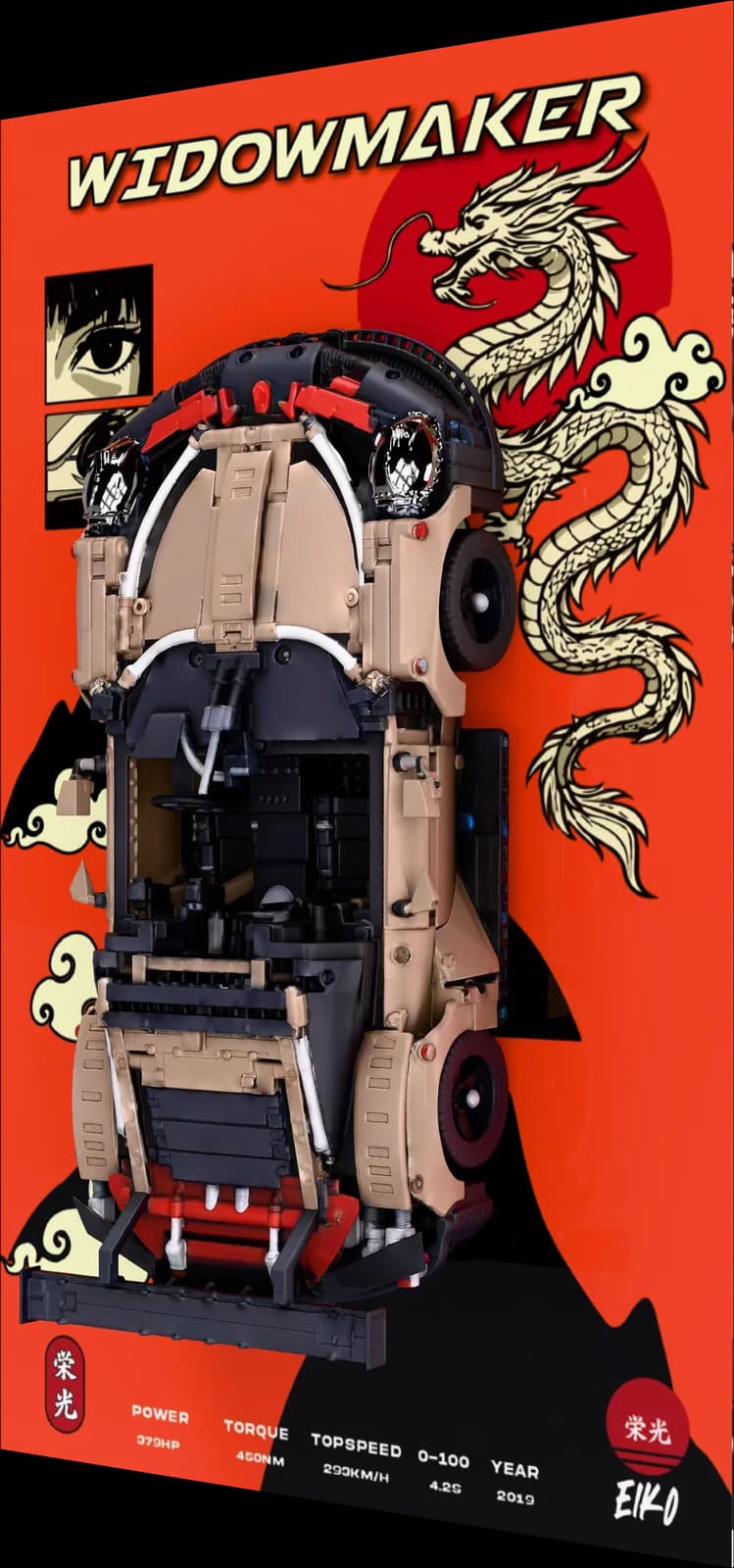 KAGE 911WIDOWMAKER
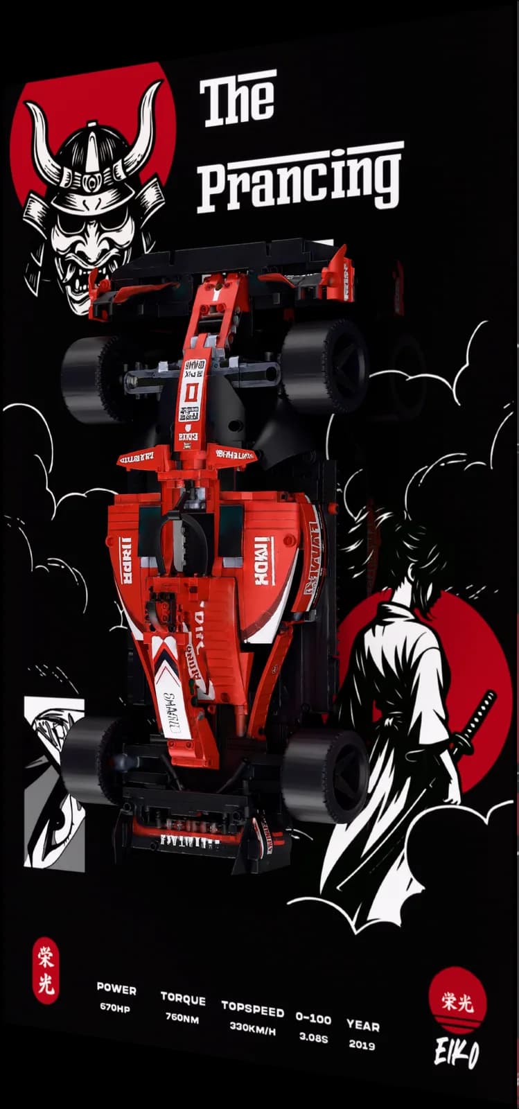 ROSSO 488The Prancing
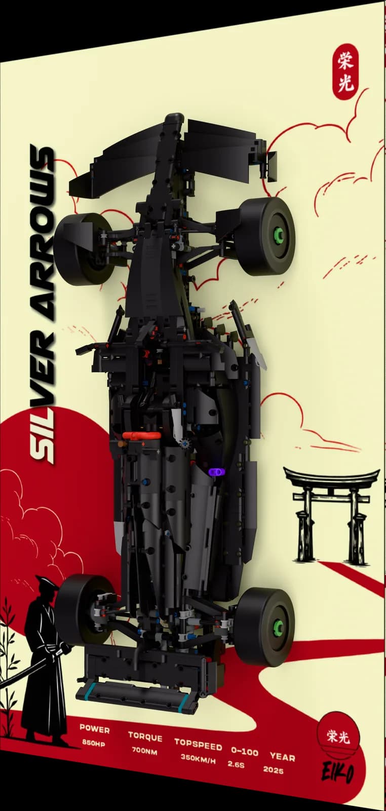 SEIRYU F1Silver Arrows
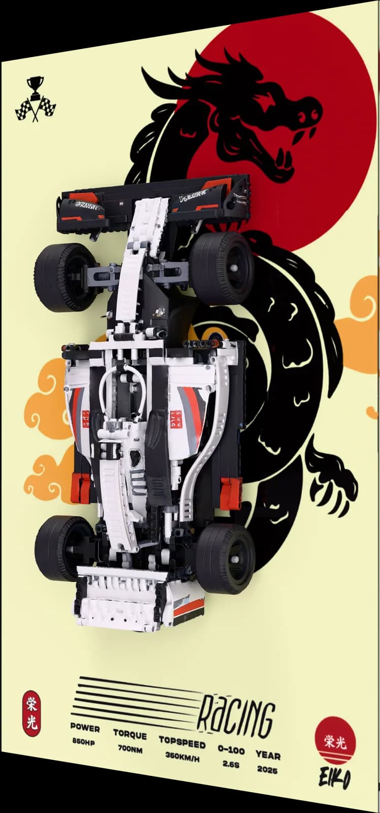 MUGEN F1 IIRacing
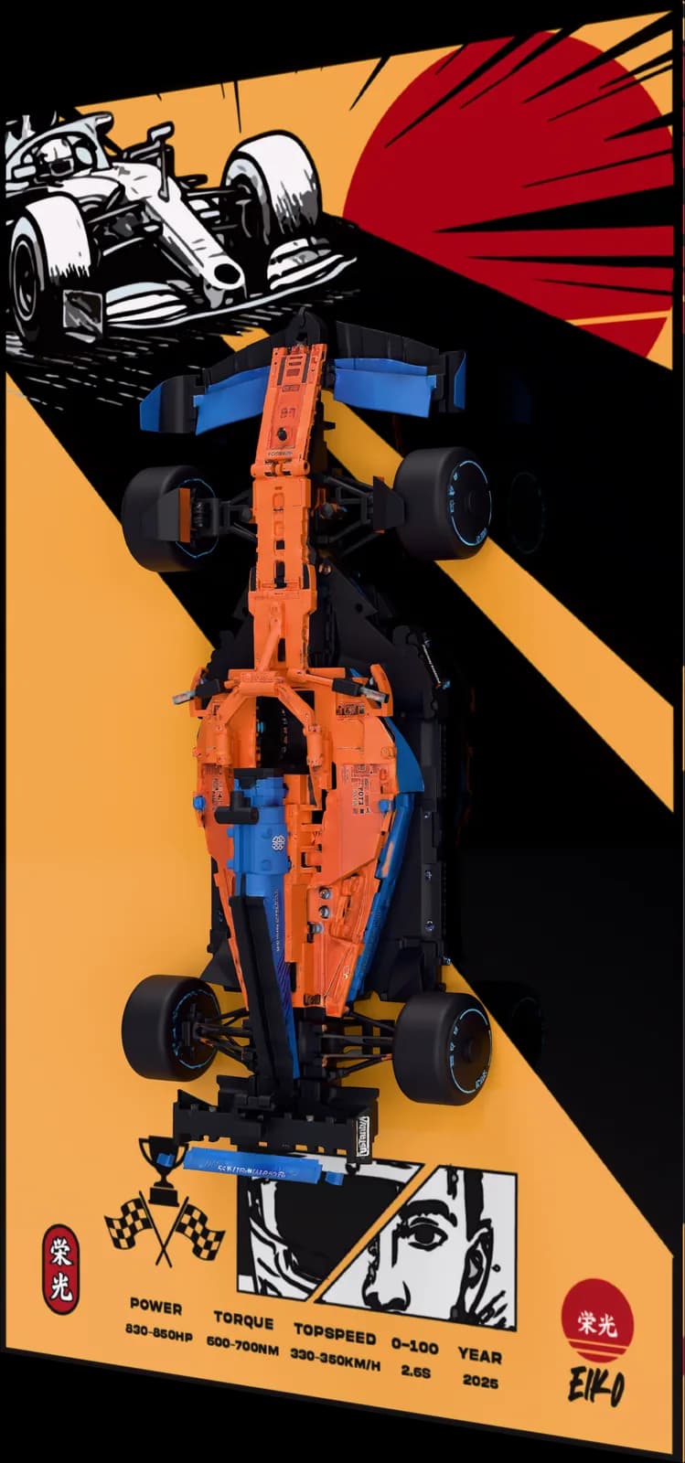 TENKAI F1
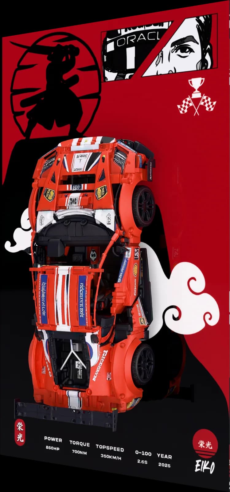 ROSSO F11
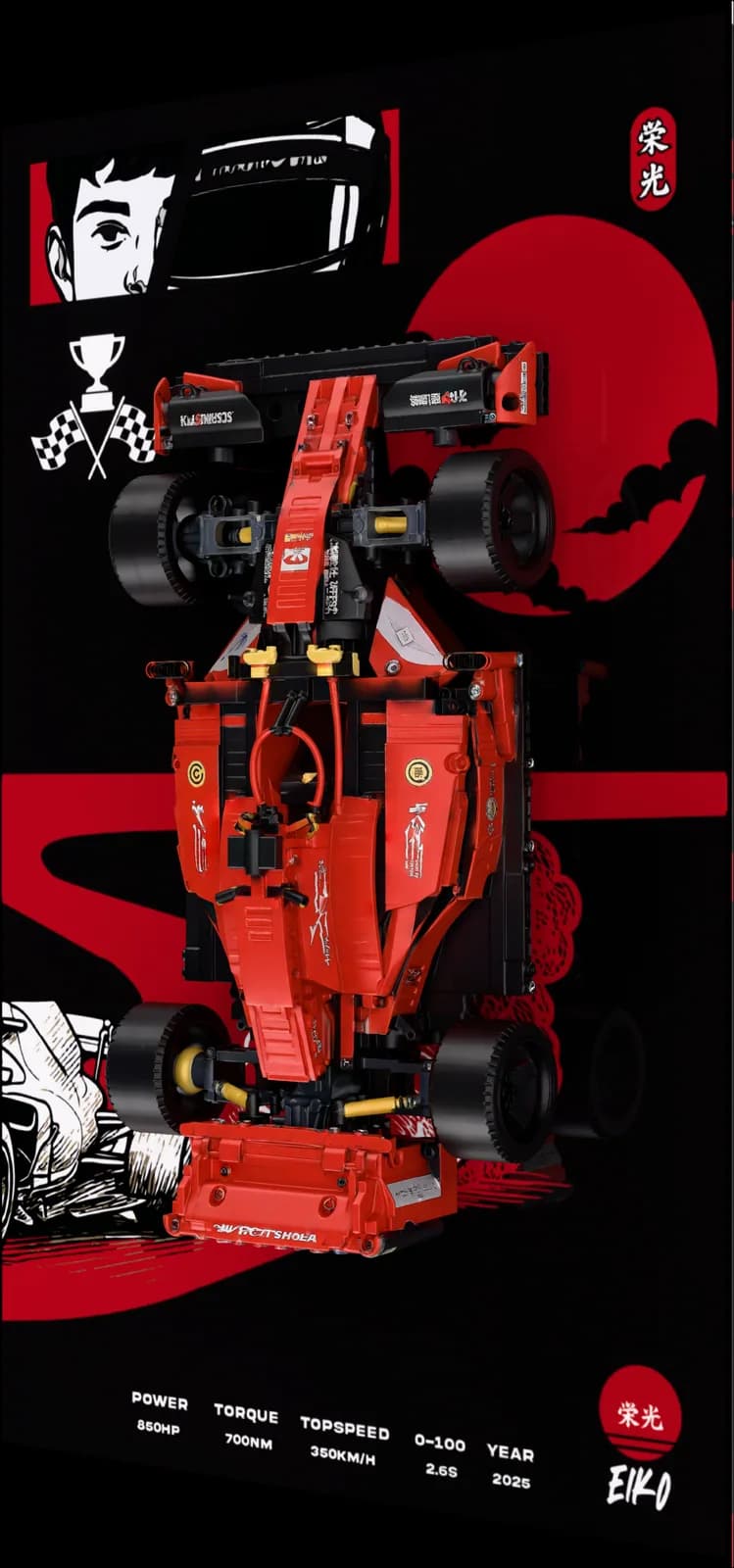 ROSSO F16
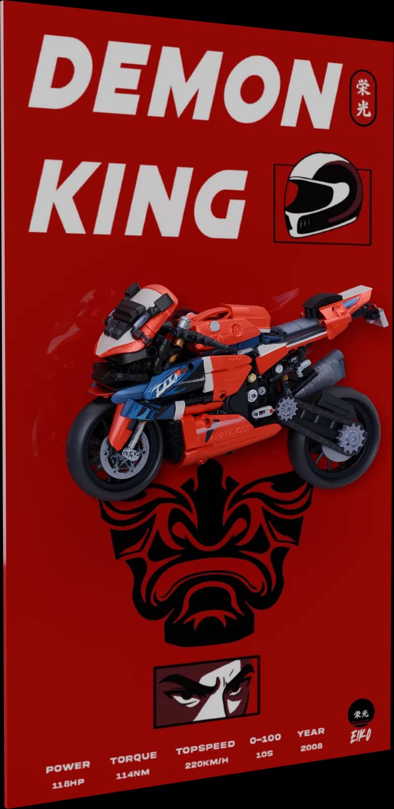 KATANA KURADEMON KING
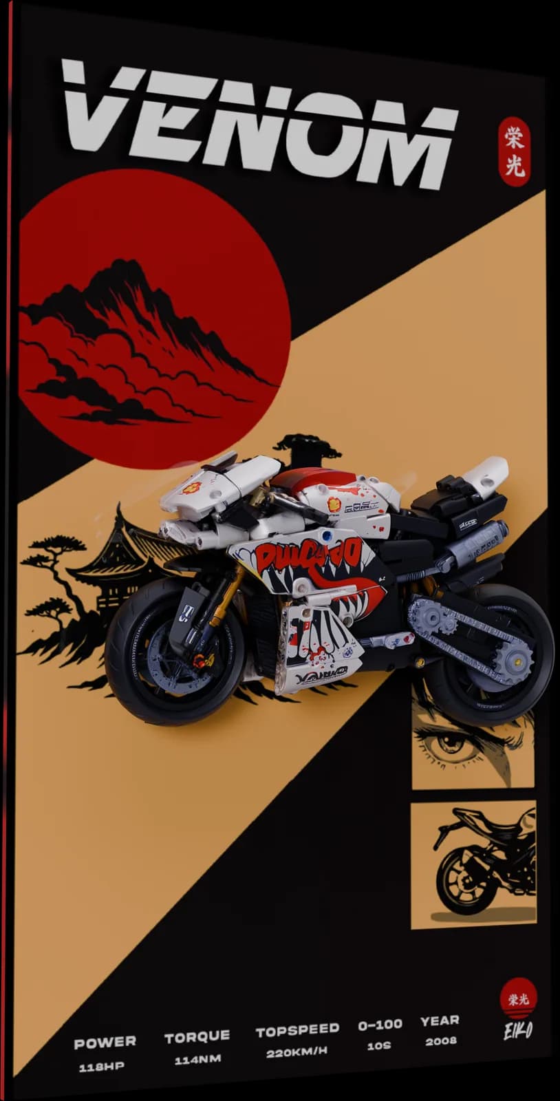 KATANA ROSSAVENOM
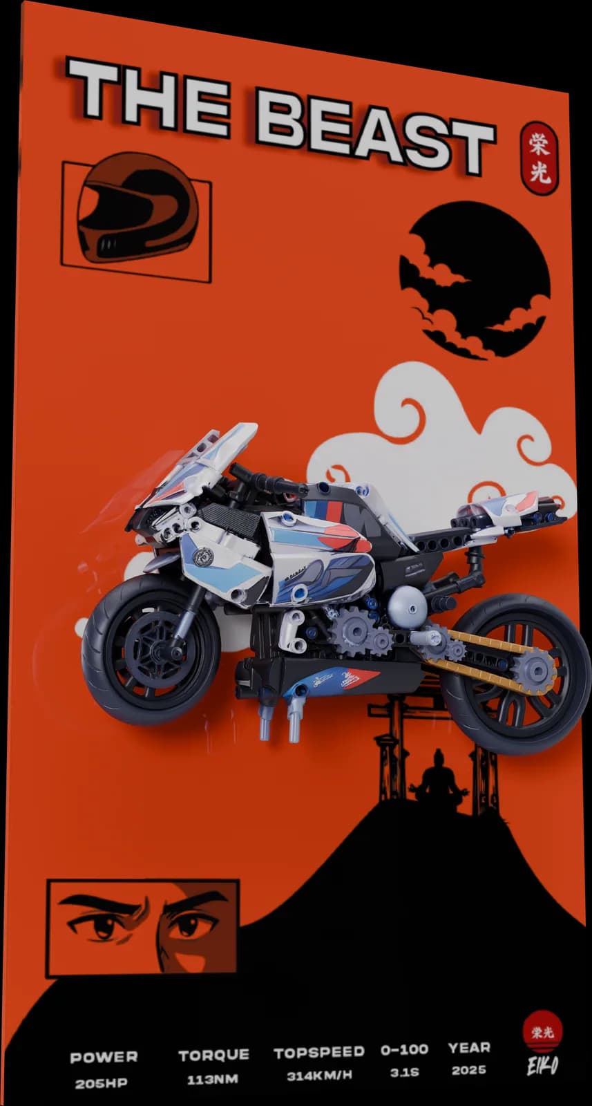 AO M1000RRTHE BEAST
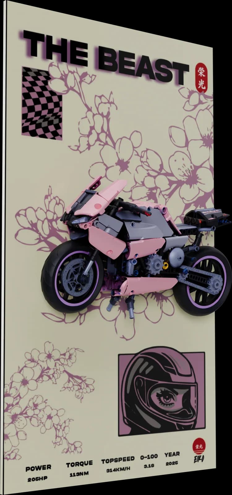 MOMO M1000RRTHE BEAST
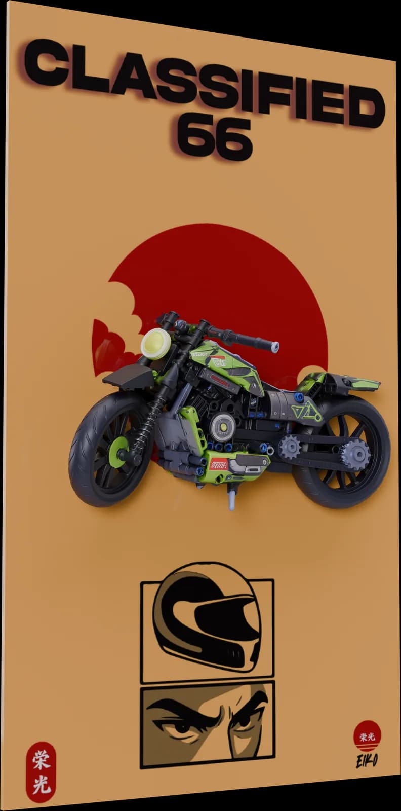 ROKUJUUROKUCLASSIFIED 66
Innovate
The people who designed the packaging built the page that sells it. The artwork is the product photography; nothing was handed between teams and nothing was lost in the handover.
Outperform
A visual system strong enough to leave its own packaging. The oni mask works on a cap because it was designed as a language, not a logo.